
![]()
Après Yahoo en 30 épisodes et Google sur une seule interface pour l’instant, Bing arbore un nouveau logo. Contrairement à ses congénères, l’identité apparaît comme l’aboutissement d’une stratégie de marque (rapprochement typographique et chromatique des autres marques de Microsoft) et propose une nouvelle interface et de nouvelles fonctionnalités. Mais une bonne stratégie n’est pas toujours garante d’une bonne identité visuelle. Le logo semble si proche des logiciels de Microsoft office que Bing semblerait se « bureaucratiser ». Espérons que cela devienne une véritable alternative au seul leader des moteurs de recherche.
« A new visual identity doesn’t just happen overnight. We spent months looking at ways to update the look of Bing to represent what the product offers today, while achieving visual parity with Microsoft’s over-arching new look for the company. We worked with product, graphic and user experience designers to create a look that matches and grows with the product.
We knew our products were evolving beyond just the traditional search page. We were building apps for Windows 8, we were integrating search into Windows Phone and Xbox. This was much more than just a new logo or a single brainstorm. We re-architected our brand vision in alignment with our product roadmap. We interviewed our teams. We talked with people who loved us, as well as people who had barely heard of us. We learned more about what sets Bing apart in their minds and how we can continue to make better products that really matter. That was the formula to create a new visual identity that best reflected Bing as part of the Microsoft family.
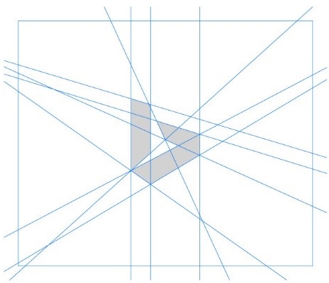
With principles and frameworks in hand, we looked at the art. We revisited the current logo and diagnosed what wasn’t working. We looked at the new Microsoft identity and we did hundreds of studies to look at motion, font, color, size and form. We built out mock ads, localized product examples for China and fictitious billboards to see what was working. From simple evolutions to ridiculous explorations, we learned something in each one.
In the end, our new logo was created to be simple, real and direct.
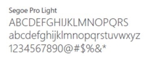
The wordmark is a customized version of our corporate font Segoe. We retained the lowercase ‘b’ in tribute to our Bing logo heritage and to provide a slightly less obtrusive stance. The descender on the ‘g’ has been slightly modified to curve upward in a friendlier manner and the cut on the top of the ‘b’ mirrors the angle on the cut of the ‘t’ in our Microsoft logo. The kerning pairs of the ‘i’ and the ‘n’ are exactly the same as the ‘i’ and the ‘n’ in the Windows wordmark. The symbol, a stylized ‘b’, evokes a sense of movement, direction and energy. The color loosely pays tribute to the orange dot from the previous Bing logo while also fully embracing the Microsoft color palette and taking inspiration from one quadrant of the corporate flag logo. » – Source : le blog de Bing‘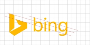
![]()
![]()
![]()