
![]()
Philips, l’un des leaders mondiaux en matière d’électroménager, d’équipement médical et d’éclairage, offre un léger redesign à son célèbre bouclier. L’objectif principal est de permettre au logo une meilleure adaptation au monde numérique. Introduit dans les années 1930, le bouclier symbolise « les produits qui améliorent la vie des gens ». Il se trouve que se sont également les produits phares de la marque en 1930.
Philips exprime une volonté de modernisation tout en conservant son identité qui fait sa force. Le bouclier prend des rondeurs. Le sommet présente une légère courbe, les étoiles, qui symbolisent les ampoules électriques, s’arrondissent également. Les vagues, qui illustrent les transmissions émises par les ampoules et les radios, sont réduites à deux et s’épaississent. L’inversion des couleurs permet une meilleure lisibilité.
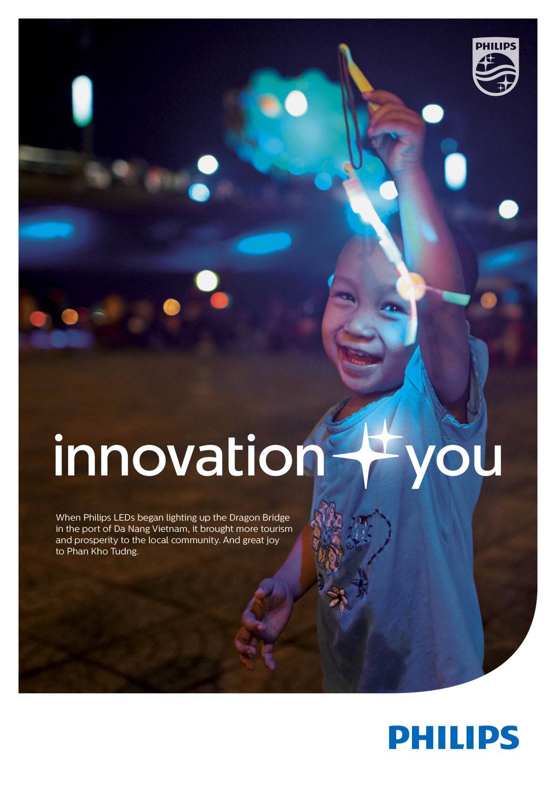
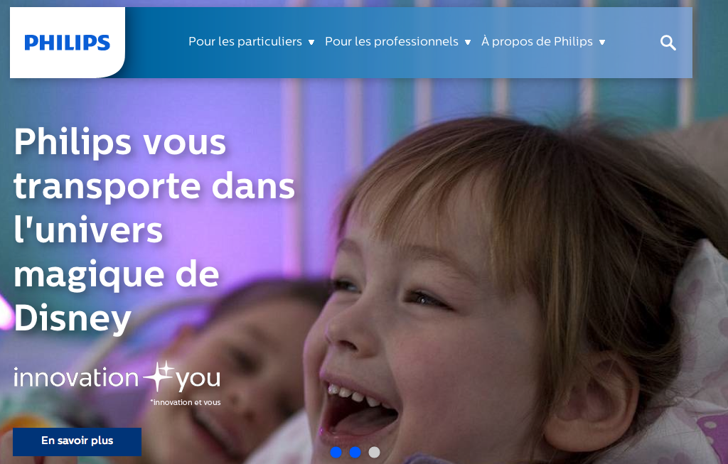
Le slogan « Innovation and You » apparaît.
La société néerlandaise explique : « The Philips brand is a familiar sight in millions of households and buildings throughout the world with its instantly recognizable wordmark of seven blue capitalized letters and the shield emblem with its stars and waves. Over more than 120 years Philips has evolved and grown, becoming a leading, highly trusted brand in markets all over the world. The company’s visual identity has remained true to its legacy, rooted in its early years at the beginning of the 20th century.
Our brand line is rooted in Philips’ strong belief that innovation is only meaningful if it is based on a deep understanding of people’s needs and desires. “Innovation and you” communicates our approach to innovation, enabling people to be healthy, live well and enjoy life. It encapsulates our starting point in understanding people’s needs and desires. When we bring the two together – people and innovation – we create the next generation of technology and things that people truly want and need. This sets us apart and makes us Philips.
The Philips shield, with the stars and waves, was defined and registered for trademark in the Netherlands in 1934 and quickly became a globally known visual icon. The stars represented the pioneering role we played in industrializing and globalizing lighting. The waves were radio transmissions, signifying our major contribution to the first global wireless communication platform. The circle came later, symbolizing the world and the people whose lives we touched.
The new shield is modernized for use in this digital age while retaining its heritage of stars and waves. In designing the new shield, the stark symmetry was replaced with curvier lines in the waves and in the top edge of the emblem. With two thicker and softer waves and a solid fill, the shield was made to look more robust, visually impactful and easier to apply on digital platforms. The trusted Philips shield continues to communicate the company’s commitment in delivering new healthcare and lighting technologies as well as innovative and locally relevant consumer products that make a real difference across the globe. »

Tout sur l’actu des logos dans les biens de consommation.

J’aime bien
Quelle inutilité : un simple restyling d »un logo vieux comme Hérode !
Quel désastre graphique : c’est moche et pas moderne. Bouclier : Beurk !
Espérons que cette « vieille » identité ne porte pas chance avec cette société.
Quand un logo a tenu depuis les années 30, c’est qu’il y a un truc qui fonctionne dedans… pour moi, le revamping n’était pas nécessaire. Mais au moins : pas de glossy, pas de dégradé, pas de recherche d’une « modernité » qui serait désuète dans 5 ans. C’est déjà ça…
J’aime bien.
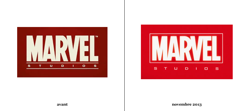
« présente de légers changements » -> en tous cas, bien plus de changements que Marvel qui, pour vous, « s’émancipe » (ce qui ne veut RIEN dire car c’est le même).
Bonjour,
Nous avons intitulé l’article de cette façon car lorsque le nouveau logo a été dévoilé, c’était la première apparition du logo de la société sans qu’il soit précédé du logo de son partenaire. Donc il s’émancipe de ses partenaires.